
LocalEyez
MACHINE-LEARNING APP FOR LOCAL EVENTS
A machine-learning, personalized mobile app experience for local events. Users receive event recommendations based on their interests and activity, and local businesses are marketed directly to their target audience.

Summary
The goal of this project was to redesign a machine-learning mobile application for local events and experiences in the area, determined by the user's interests. As a solo project, my role included all phases of the design process including ideation, strategy and design layout.
Role and Responsibilities
ROLE
Usability testing, strategy, prototyping, branding, visual design
DELIVERABLES
Wireframes, Prototypes
TECH STACK
Figma, InVision
The Problem
LocalEyez wanted to go in a different direction by moving away from web-scraping into exploring the idea of a membership that provides the user with access to experiences like a local tour, a kid-friendly Shakespeare in the Park, fundraising events, etc.
The Audience
The target audience for LocalEyez had already been established prior to my role, so no additional research was needed.
AGE
21 to 50 years old
ANNUAL INCOME
$30,000 to $120,000
LOCATION
Large Urban Areas, United States
INTERESTS
Food tours, bar crawls, trivia nights, hiking, festivals, block parties, art walks, sports, nightlife, concerts, board games, family friendly, bowling
ATTITUDES
Optimistic, social, seeking spontaneity
CHALLENGES
Social isolation due to urban culture, lack of time and organization for family outings, friends are picky
The Solution
I redesigned the app to incorporate innovative machine-learning that will use the user's current inputs, personal profile, and past events to improve the tailored experience.
LOCALEYEZ LETS USERS...
-
Choose their top interests
-
View popular events in their area
-
View suggested events based on their interests, past events, and location
-
View their upcoming and past events in detail
-
Conveniently rebook past events
-
Get notified about new events that may interest them based on their interests, past events, and location
The Process
KEY BUSINESS REQUIREMENTS
-
The app should help them find a local activity to attend
-
The app should provide personalized information that makes it more relevant to them
-
The app gives them control over their interests/preferences
SCOPE
-
Run a design sprint to produce an MVP
-
Complete the user interface and implement visual design
-
Implement features for personalization and machine learning
CONSTRAINTS
-
Time: The team at Localeyez provided a 1-week turnaround time for completion
-
Budget: No budget was allocated toward any additional user research, which meant being resourceful in crafting materials and in user testing participant selection
-
Design and styling: Branding guidelines and loose wireframes have already been established
Personas
The team at LocalEyez provided me with 2 personas that embodied our primary users:


Comparative Analysis
A comparative analysis between 4 other brands in the same industry were provided by the LocalEyez team's business analyst:

AIRBNB EXPERIENCES
This is Airbnb's initiative to build connections between its visiting customers and locals. Users can choose categories, hosts, and locations to find something that interests them. Categories for experiences include animals, cooking, adventures, and more. Choosing a host allows users to select an experience by clicking on an image of a person and a description of the activity, such as "mole cooking class with an Indigenous cook." And users can search for locations to stay in either locally or around the world.
CLASSPASS
Classpass is a fitness membership that gives its customers a range of exciting workout choices. Founded in 2013, ClassPass has over 8,000 partners in 39 cities worldwide, allowing its users to work out wherever they live and travel. Its proprietary technology lets users choose from over a million fitness classes in an easy booking process.
FOURSQUARE
Foursquare is a location technology company that consists of two apps, Foursquare and Swarm. Their B2B offerings include Places (for developers), Pinpoint and Attribution (for marketers), and Place Insights (for analysts, based on the world's largest foot traffic panel).
MEETUP
Meetup is an online service used to create groups that host local in-person events. The company had more than 35 million users as of 2017. Customers can use Meetup for networking purposes, to make new friends, or to find an activity group.
Competitive Analysis
I conducted a competitive analysis between 4 other leading competitors in the industry. I noticed they all seemed to miss several key features that event-goers would hope to utilize when signing up for a machine-learning app.

Information Architecture
In order to create a solid foundation for which my designs would play out, I used multiple strategies of information architecture to practice user-centered design that would remain relevant and intuitive for our users.
LOCALEYEZ'S EXISTING WIREFRAMES
The team at LocalEyez provided these web wireframes to base the mobile app's design around.

USER FLOWS
In order to lay out the foundation of our users’ movement throughout the app in a simplistic way, I constructed a task-based user flow.

SKETCHING
This phase mapped out the final solution through exploration, ideation, and refinement of the app’s layout.
My sketches were based around LocalEyez's existing web wireframes, with refinements to how I felt the user flow should exist. Since I was designing solely for the mobile app, I wanted to keep some visual consistency between the website and the app to build more brand loyalty for our users. Since some instances of web design may not translate well to the app (i.e.; the hero image on the website's home page), I made sure to still incorporate most of the same elements and features, but optimized the layout for a user-friendly mobile app experience (i.e.; moved the hero image to the app's opening screen in Sketch 1).

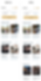
WIREFRAMES
After better understanding our users, the structure of the app is designed through wireframes to serve as the blueprint for the final design. The wireframes will contain the information architecture and content strategy for our application.

USABILITY TESTING
In order to find out what worked, what didn’t work, and what needed to be fixed in the current version of the app, I performed usability testing with participants to test my assumptions and fail early. This would provide me with vital feedback in order to create new iterations. I tested 5 users whom each performed 4 specific tasks.

RESULTS
-
Average % of task successes: 95%
-
Average % of task failures: 5%
-
Average amount of extra time taken to complete tasks: 1 second longer
Branding and Styling
After researching our target market and planning for design, I knew it was essential to improve the user interface while also keeping with many of the original design elements in order to maintain brand loyalty. LocalEyez's original branding was outdated and irrelevant to our existing user base.
LocalEyez's Original Brand and Styling
Because the startup was still small, the design of LocalEyez hadn't been finalized yet and they were initially still using a logotype in the brand font, Sigmar One. The team had followed a loose style guide up until my involvement.


LocalEyez's Rebrand and Styling
LOGO AND TYPOGRAPHY
The original logo was a heavy Sans Serif font that seemed more suitable for marketing towards a younger target audience. The logo I designed was geared more towards our ideal audience with a relaxed script in our brand's new primary colors. The chosen typeface for the app is a minimalist Sans Serif to pair well with the logo script, so as to not compete for attention.
COLOR PALETTE
The new color palette backboarded off the original, with blue and brown hues to maintain brand loyalty within our existing user base. I chose brighter, more inviting hues that correlated well with the outdoors and nature, to give off the organic, minimalist look and feel that LocalEyez was lacking.
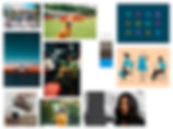
MOOD BOARD
The new mood board provides a more cohesive visual understanding of what it is we want to attract with our users: social involvement, fun, and the freedom to try new things. Some visuals were chosen with the new color palette in mind, so as to not lose sight of where the brand was headed. In the original mood board, social activities were not a primary focus, and instead we were shown abstract people and places that didn't speak to the brand's mission.


Design Iterations
Based on the usability testing results, some key suggestions were made which drove some refined solutions for next steps.
DESIGN ITERATION #1
-
User feedback: Users were confused by what the calendar highlights meant without prior context.
-
Iteration: Move the 'Upcoming Events' header above the calendar to signify what the highlights were referring to.

DESIGN ITERATION #2
-
User feedback: Users mentioned that if they did not have the "upcoming events" banner at the top of the page (if they had no upcoming events on their calendar), they would've expected to see an Upcoming Events category slider on the home page much like for Popular Events and Suggested Events.
-
Iteration: Create an 'Upcoming Events' category slider on the home page for more intuitive navigation.
Conclusion
This was my first experience designing for a machine-learning app, which gave me the opportunity to consider how, as a user, I'd like to be marketed to in a relevant way according to my personal needs. By considering how users are already familiar with booking (events, vacation stays, etc.) in some existing popular applications, I was able to garner those pre-existing solutions and fill in the gaps by designing with machine-learning personalization in mind.
NEXT STEPS FOR IMPROVING THE APP
-
Consider making a Social/Community feature where locals can openly rant/rave about their experiences and favorite activities in the area. This would add a layer of interaction that could incentivize users to take action on booking experiences.
-
Explore the idea of partnering with local events to provide a discount code exclusive to LocalEyez users, and create an 'Exclusive Discounted Events' category
LEARNING OPPORTUNITIES THAT AROSE FROM THIS PROJECT
-
Users don't mind if important features can be found in several different areas as long as their placement is intuitive so they don't feel like their time is being wasted searching for it in the app
-
Being open-minded and implementing user feedback early ensures the best and most user-relevant outcome for the rest of the design process
-
Labels and navigation — even when their placement feels implicit to the designer — should be clear, instead of assuming the user doesn't need direction throughout the flow of the app